![]()
![]()
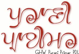
Since 2003, when PDL started digitizing manuscripts, the most common question we have faced is about the rationale behind digitizing multiple copies of same manuscript. Though there are many reasons, some very serious, but the most common answer that we have given is that every manuscript carries a different handwriting style, and this will assist in developing thousands of fonts for Gurmukhi script. Putting traditional writing style in modern applications of writing as font in itself is an act of heritage conservation in operative form. In 2003 less than 50 fonts of Gurmukhi were available. Last ten years have seen few hundred fonts coming up. Most beautiful handwriting style found in an almost hundred year old Gurmukhi Primer [1916] kept on waiting for being developed as font. The cursive touch was just out of the world, never seen in Gurmukhi. The surprise came when we shared it on PDL's Facebook page, www.facebook.com/PanjabDigiLib.org.
It was beyond our imagination that this post can tempt Hardeep Singh Mann to forward it to Paul Grosse to develop a full fledge font on the style of the calligraphic elegance marked on the pages of the primer.
 Paul approached us with the proposal to develop a font and requested for high resolution images of the primer, which were supplied. The next two months saw couple of email exchanges. Finally the font was ready and Paul launched it free for everybody. It has been named as GHW Purani Primer PDL, where he chose to include the abbreviation of Panjab Digital Library as part of the name of the font owing to the source of the folio that triggered him to take on this task. The font is compatible with Unicode standard which means that the font is readable on all the modern devices that show Unicode fonts correctly. The font also covers its ASCII standard counterpart and therefore, it is virtually useable on all the devices.
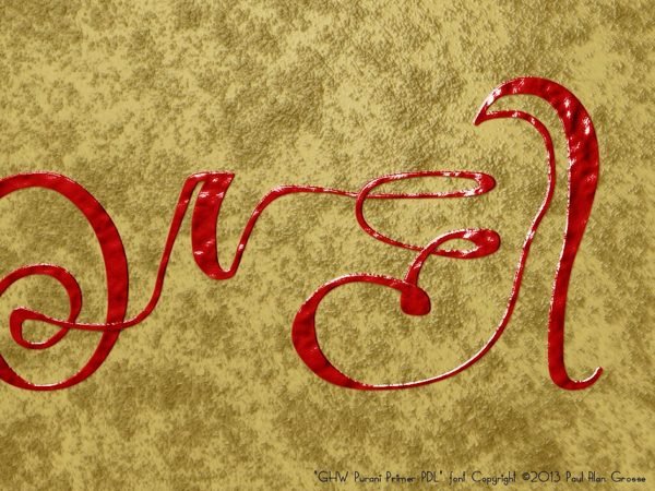
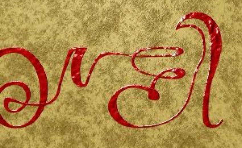
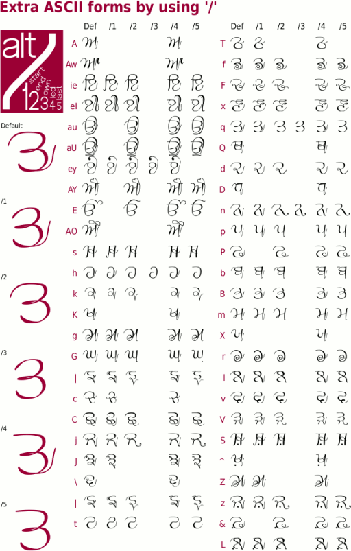
As the font has been designed from a handwritten primer, Paul has given a lot of emphasis on creating multiple variants of each letter so that they do full justice to the context in terms of the shape of each letter in relation to the other letters in row. Paul makes use of the forward slash (/) and the numerals (0-9) to let the user make use of any of the variants of a particular letter which has to be done manually in case of ASCII font. The Unicode font takes the user experience to the next level by automatically choosing the best variant of these letters while a word is being typed.
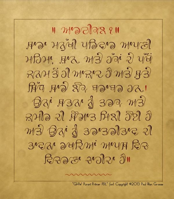
Basic Paintee (Gurmukhi Alphabets) apart, the font takes care of various Panjabi words that are commonly used and gives options to type them with ease. Similarly, lagan-maatran can be fixed through routine phonetic keys. Paul has given a simple tutorial for those who are interested in understanding and using the latest font in the field of research in the service of Panjabi language. PDL consider this font to be an achievement in knowledge production in Gurmukhi script. We express our gratitude to Hardeep Singh Maan and Paul Grosse who has made this writing style functional through modern technology. It is time to thank to all those who conceived, produced, preserved and kept the primer safe till date.
| GHW Purani Primer PDL font Digital Art, Typography, Writing |
||
|
| ||
|
I had seen this before but somebody let me know that it might be an interesting idea to make a font out of it so I thought that I would give it a go. I have created many Punjabi fonts in the past (these have been used in Bollywood films, on the covers of dozens of novels, in newspapers and magazines and so on) including the Gurvetica font - a font I designed back in 2008 and released in 2009 that combines the legibility of Helvetica with Punjabi Gurmukhi, to create a high-legibility, machine-produced font. In effect, GHW Purani Primer PDL, with its deliberate lack of a bar and cursive features is the opposite of Gurvetica.
It also posed some interesting challenges - largely down to the fact that there is rather a lot of programming in the font. First of all, it had to be compatible with both ASCII-range and Unicode-Gurmukhi-range because some of the users have Unicode and some use ASCII. The usual mappings of Unicode Gurmukhi range into the ASCII range is straight-forward but with five or six versions of each glyph to select from, I needed another way of doing it. So, I chose to use ligatures. Simply, select the ASCII letters you would usually use and where the default version is not the one you want, press the slash key'/' and then a number to give you the correct version.
Then, there are dulaunkard and paer versions, all with their own codes. Using it in ASCII is not a nightmare however, the font prompts you so that you can select the correct version with ease. The Unicode coding is done automatically and is very easy - it is no different to typing any other Unicode text - with paer characters, dulaunkard variants, initial final medial forms all taken care of. There is more about his font and you can download it for free for any purpose that any normal user would make of a font from here Animated version: Look at how the characters change as you add following letters. Have fun. | ||